Wedding Color Palette: Combinations, Meanings and Uses
- #weddings
- #wedding trends
- #wedding planning
Choosing the perfect color palette for your wedding is one of the most exciting decisions! From the dress to the decorations, the colors you choose not only reflect your style but also convey emotions and create the atmosphere of your big day. But do you know what those tones really mean? Or which ones you should avoid at all costs?
In this article, we'll dive into the fascinating world of color in weddings. We'll help you understand the meaning of colors, give you ideas for combinations, and of course, tell you about those tones that, by tradition or superstition, are better left out of the big event, especially if you're a guest!
What do colors mean in a wedding?
Colors are much more than simple tones; they are carriers of meaning, emotion, and tradition. When choosing your wedding colors, you're telling part of your story and the type of energy you want surrounding your union. Let's discover what's behind some of the most popular colors!
Meaning of white color in weddings
White is undoubtedly the king of weddings in many Western cultures. Traditionally, it symbolizes purity, innocence, virginity, light, and new beginnings. It's the bride's color par excellence, evoking a feeling of cleanliness, peace, and perfection. Although its symbolism has evolved over time, it remains the color most associated with pure love and nuptial celebration. It's timeless, elegant, and serves as a perfect canvas for any other color you want to add to your palette.
What it means to wear red to a wedding
Red is the color of passion, intense love, energy, and boldness. While it's a vibrant and lively color, its use in weddings, especially by guests, can be a delicate subject. Traditionally, wearing red to a wedding has been interpreted in some places as a desire to "steal the spotlight" from the bride or even, in older superstitions, as a sign of bad omen or that the person in question is the mistress.
Today, these interpretations are less strict and depend greatly on culture and the couple. If the wedding is modern and the couple is bold, a touch of red can be spectacular. But as a guest, it's always prudent to use it in moderation or as an accent, or consult directly with the couple if you have doubts!
What it means to wear green to a wedding
Green is the color of nature, growth, harmony, hope, and good luck. It's a wonderful choice for weddings, both in decoration and guest attire. It symbolizes freshness, fertility, and stability, making it a very positive color for starting a new life. Today, with the growing popularity of natural, rustic, or eco-friendly themed weddings, green has become a leading color, bringing serenity and a very chic organic touch.
What it means to wear pink to a wedding
Pink is the color of romantic love, femininity, sweetness, and happiness. From soft pastel tones to vibrant fuchsias, pink is incredibly versatile for a wedding. Lighter pinks convey delicacy and innocence, ideal for a tender and dreamy atmosphere. Stronger tones like fuchsia or bubblegum pink bring fun, energy, and a modern touch. It's a color that radiates joy and optimism, perfect for celebrating love in all its forms.
What color brings luck for getting married?
In many cultures and traditions, there are colors associated with good luck for couples. Blue is one of the most widespread, especially due to the tradition of "something new, something old, something borrowed, and something blue." Blue symbolizes fidelity, purity, and lasting love. Another color often associated with good fortune is gold, which represents prosperity, wealth, and success. If you're looking for a touch of luck on your big day, including these colors in small details of your attire or decoration can be a beautiful tradition.
What colors are forbidden or frowned upon at a wedding?
Just as there are colors that bring good omens, there are others that, by tradition, superstition, or simply pure etiquette, are better avoided, especially if you're a guest. Respecting these "unwritten rules" is a sign of consideration towards the couple and the meaning of their day.
What colors should you avoid wearing to a wedding?
If you're a guest, the golden rule is not to outshine the couple. This means certain colors or styles are generally discouraged:
- White (or very light and bridal tones): Absolutely the bride's color. Unless the invitation specifies a white "dress code" for all guests (like at an Ibizan wedding), it's the color to avoid par excellence. This includes cream, ivory, very light beige, or any color that could be confused with the wedding dress.
- Total black (for daytime weddings): Although black is elegant, at daytime weddings it can seem too somber and associated with mourning. It's more appropriate for evening or gala weddings, and even then, many prefer to break it up with colored accessories to give it a more festive touch.
- Vibrant red (with caution): As we mentioned, pure and very eye-catching red can be perceived as an attempt to draw too much attention. If you use it, let it be in a more discreet tone or combined with other colors that soften it.
- Neon or extremely eye-catching colors: Fluorescent or very bright tones can divert attention and not fit with the generally more classic or elegant atmosphere of a wedding.
The key is always to think about the context of the wedding, the time, and the couple's style. If you have doubts, pastel tones, blues, greens, corals, or lavender are usually safe bets.
Forbidden colors at weddings and why to avoid them
Beyond what "isn't advisable," some colors are practically a no-go for very specific reasons:
- White (always): The reason is simple and forceful: it's the color reserved exclusively for the bride. Wearing white as a guest is a direct disrespect to the protagonist of the day, implying that you're trying to compete or, worse yet, that you don't know the basic rules of wedding etiquette. It's the only universal prohibition in Western weddings.
- Black (in some cultures/for brides): In certain cultures, black is associated with mourning and sadness. For a bride, wearing black at her wedding would be an omen of misfortune. For guests, although it's acceptable at formal evening weddings, it's always good to consider it with vibrant accessories to avoid conveying a gloomy feeling.
Can you wear white to a wedding if you're not the bride?
No, under no circumstances, unless the invitation explicitly indicates it as a "dress code" (for example, a "white wedding" or Ibizan theme).
This is the most fundamental and universal rule of wedding etiquette. On the wedding day, white is reserved solely and exclusively for the bride. Wearing white as a guest is a serious breach of protocol, as it directly competes with the bride and can seem like an attempt to steal her spotlight. It's a gesture of consideration and respect towards the couple and the meaning of their big day.
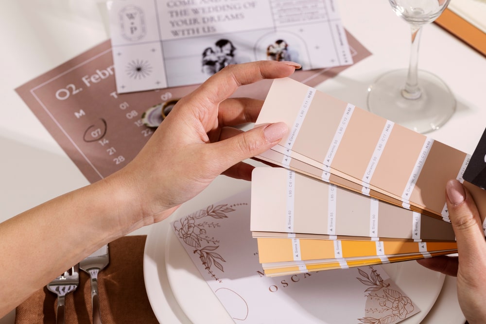
The best color combinations for your wedding (with examples)
Once you understand the meaning behind each color, the next step is the magic of combination. Choosing your wedding color palette is like painting a picture: each tone must complement the other to create a cohesive and harmonious masterpiece. Here are some of the most inspiring combinations!
5 beautiful color combinations for 2025 weddings
Trends come and go, but some combinations have a special charm that makes them endure. For 2025, these palettes are setting the standard for their beauty and versatility:
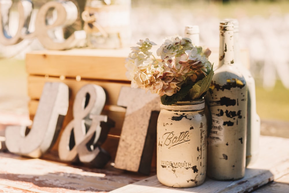
- Sage Green and Cream/Broken White: A serene and sophisticated combination, perfect for weddings with a natural and elegant touch. Sage green brings freshness, while cream and broken white tones add warmth and luminosity. Ideal for outdoor, rustic, or minimalist style weddings.
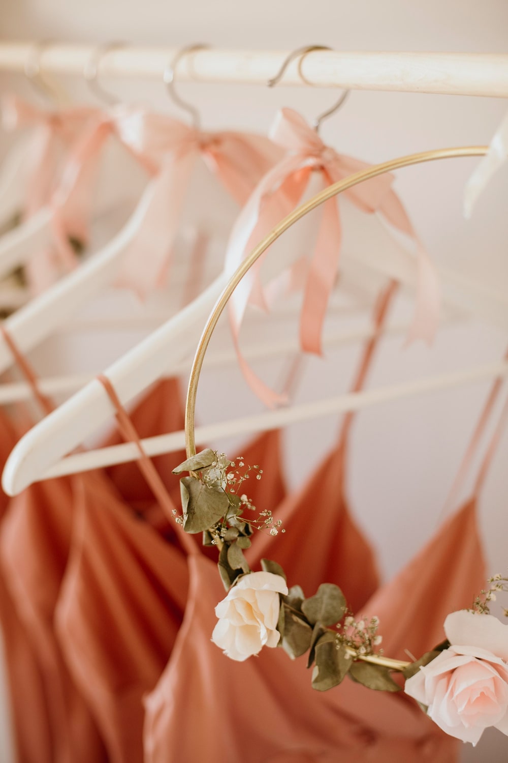
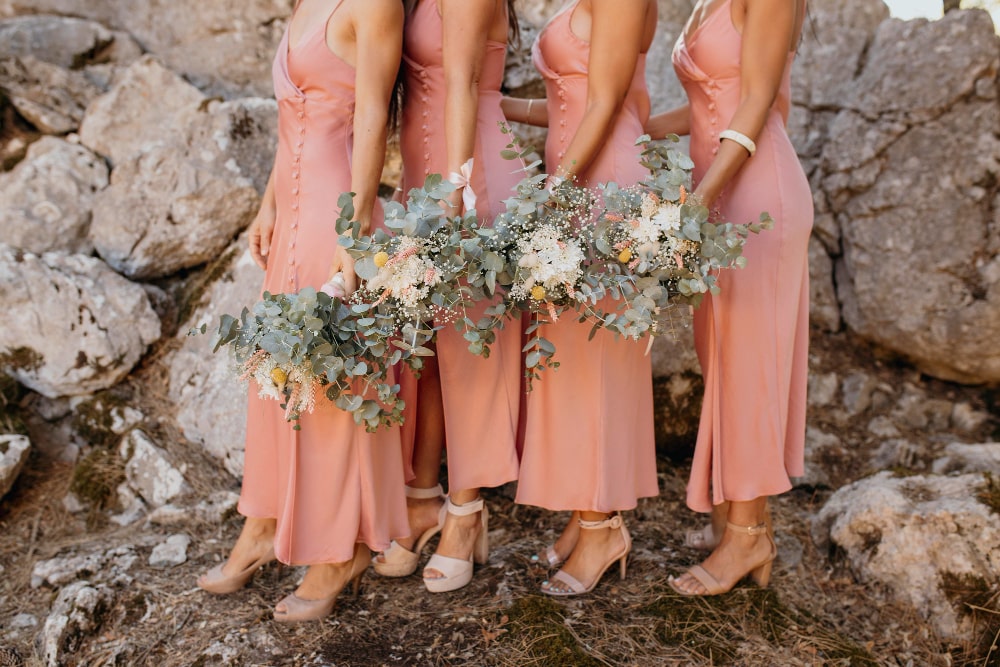
- Terracotta and Neutral Tones (beige, sand): Evokes the warmth of sunsets and connection with the earth. Terracotta, with its reddish and orange hues, combined with soft neutrals, creates a cozy and bohemian atmosphere. Fantastic for desert-style, rustic chic, or vineyard weddings.
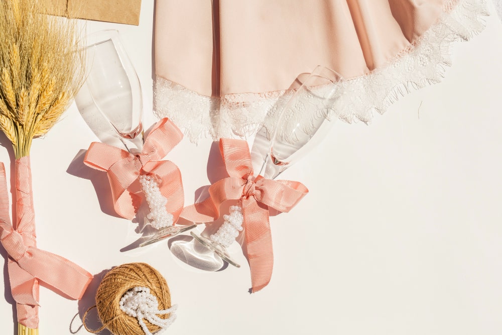
- Powder Blue and Dusty Pink: A classic and eternally romantic duo. These soft and ethereal tones evoke delicacy and daydreaming. Perfect for vintage-style weddings, modern princesses, or celebrations full of tenderness and sweetness.
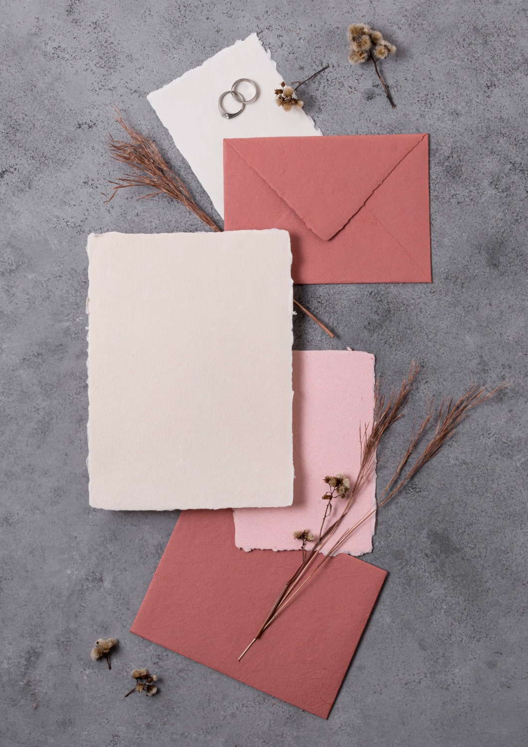
- Burgundy and Gold: For a wedding with drama and luxury. Deep and passionate burgundy finds its ideal partner in the opulent shine of gold. This combination is synonymous with elegance, sophistication, and a festive touch. Ideal for autumn/winter weddings or gala events.
- Pale Yellow and Pearl Gray: A luminous and surprisingly chic choice. Pale yellow brings joy and a vibrant touch without being overwhelming, while pearl gray gives it elegance and modernity. It's a fresh and unique combination for spring or summer weddings.
Color palettes by season (spring, summer, autumn, winter)
The season of the year can be your best guide for choosing your color palette. Nature itself gives you clues about which tones work best at each moment.
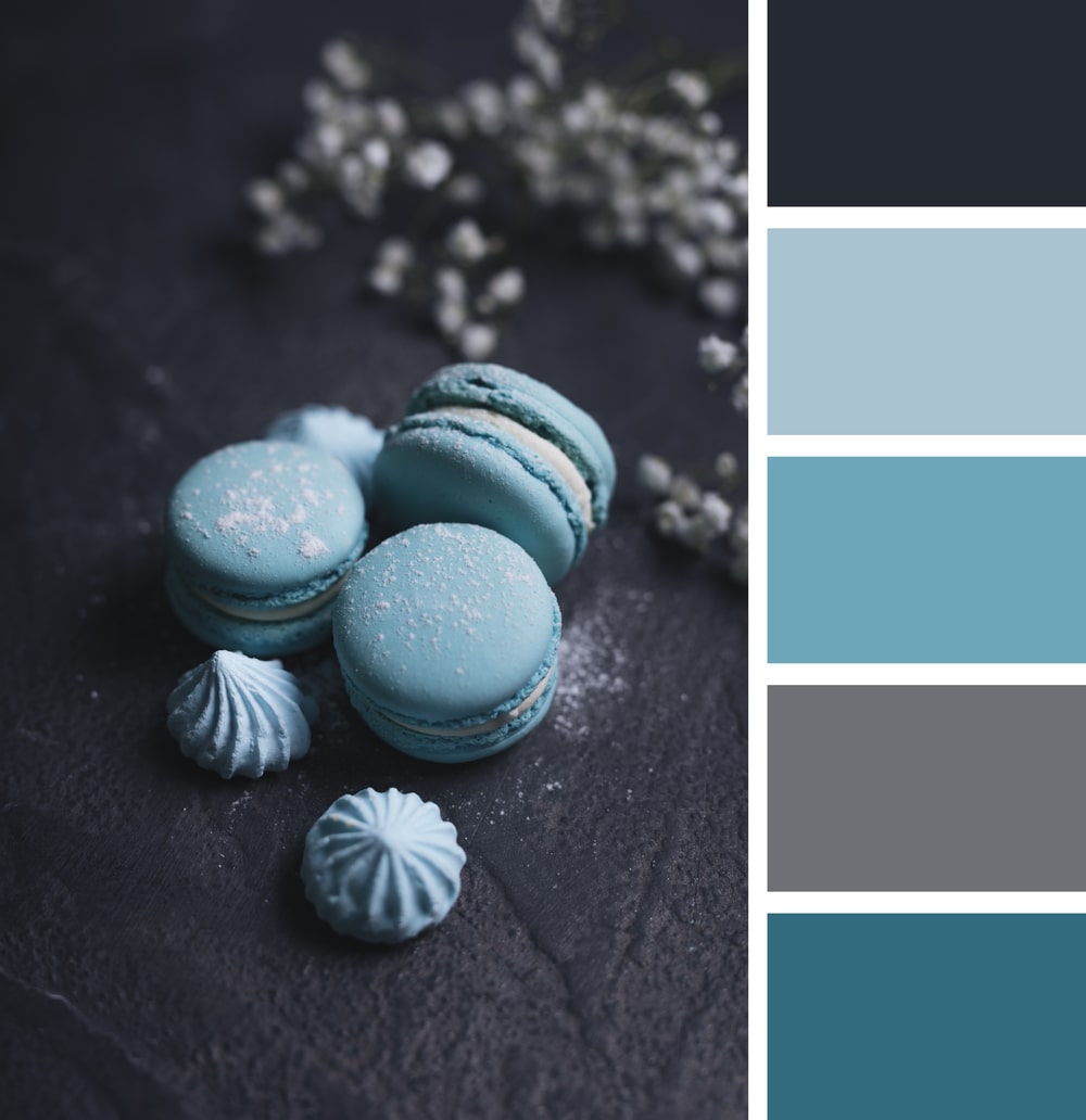
- Spring: Bloom with the season! Think of pastel and cheerful tones: soft pinks, sky blues, mint greens, lavender, pale yellows, and delicate corals. They reflect renewal, freshness, and the sweetness of new beginnings.
- Summer: Take advantage of light and vitality. Opt for more vibrant and fresh colors: turquoise blues, aquamarine greens, fuchsias, coral oranges, bright yellows, and crisp whites. They're ideal for beach weddings, outdoor events, or celebrations with a festive and energetic atmosphere.
- Autumn: Be inspired by the warm and rich tones of nature. Think of burgundy, burnt oranges, chocolate browns, golds, olive greens, ochres, and plum. They create a cozy, romantic, and sophisticated atmosphere, perfect for rustic weddings or more intimate settings.
- Winter: Evoke the elegance and brilliance of the season. Cold and deep colors are ideal: navy blues, silver grays, pure whites, intense reds, emeralds, and bright golds. They bring a touch of luxury, sophistication, and warmth despite the cold outside.
Elegant and timeless colors for weddings
If you're looking for an aesthetic that never goes out of style and radiates sophistication, these combinations are foolproof:
- White and Black (with metallic accents): The quintessence of elegance. A bold and chic combination that can elevate any event. Ideal for formal, gala, or very modern and minimalist style weddings. A touch of gold or silver adds just the right shine.
- Emerald Green and Gold: Sophistication and luxury with a touch of nature. Emerald green brings depth and richness, while gold adds glamour. Perfect for winter weddings, evening events, or celebrations with a vintage and opulent air.
- Navy Blue and White/Cream: A classic and versatile combination that evokes serenity and confidence. Navy blue is a deep color that works well in any season, and combined with white or cream, it creates a clean and elegant atmosphere, ideal for nautical or more traditional weddings.
Modern and minimalist combinations
For couples who prefer simplicity, clean lines, and a contemporary aesthetic, these palettes are the ideal choice. Less is more, and these colors prove it abundantly:
- Charcoal Gray and White with Metal touches (copper, rose gold): An industrial-chic combination that is pure minimalist sophistication. The contrast of dark gray with white creates a neutral and elegant base, while metallic touches bring warmth and modernity. Ideal for urban weddings, in lofts or art galleries.
- Warm Neutrals (beige, sand, taupe) and Dried Green: A palette inspired by nature in its purest state, with a feeling of calm and authenticity. Perfect for modern bohemian weddings, in the desert, or with a very organic focus. Add natural textures to enhance the effect.
- Total White with Textures and Vegetation Accents: Although it seems simple, "all white" is incredibly modern when playing with different textures (linen, silk, light wood) and complemented with abundant vegetation (eucalyptus, olive). It creates a luminous, ethereal, and sophisticated space.
Wedding themes according to colors
Colors are not just decorative; they're the foundation for building the atmosphere and style of your entire wedding. Choosing a color palette consistent with the theme you have in mind will help you create an unforgettable and visually impactful celebration.
Romantic weddings: pastel and dusty tones
For couples who dream of a day full of tenderness, delicacy, and a fairy tale air. Romantic weddings are nourished by the softness of colors that evoke love and daydreaming:
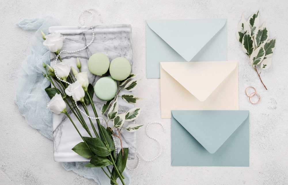
- Rose Quartz, Serenity Blue, and Lavender: A dreamy triad. These pastel tones create a soft, ethereal, and deeply romantic atmosphere. Ideal for abundant floral decorations, light fabrics, and soft lighting that enhances the magic.
- Soft Peach and Mint Green: Freshness and sweetness. This combination brings warmth without being intense, perfect for spring or summer weddings with a vintage and charming air. Think of floral details in these tones and decorative elements with a retro touch.
Rustic weddings: earth colors and greens
If your vision is an authentic celebration, connected with nature and with a countryside charm, earth colors and greens will be your best allies. These tones reflect the warmth of the natural and elegant simplicity.
- Brown, Beige, Olive Green, and Burgundy touches: A palette that emanates warmth and authenticity. Brown and beige as the base, olive green bringing that touch of nature, and burgundy adding depth. Perfect for farm, forest, or vineyard weddings, with wood, burlap, and lots of vegetation as main elements.
- Sage Green, Cream, and Natural Wood: A softer and more luminous version of the rustic wedding. The freshness of sage green combined with the purity of cream and the texture of natural wood creates a cozy, chic, and very photogenic atmosphere.
Elegant weddings: black, gold, and white
For couples seeking a wedding with a touch of luxury, sophistication, and glamour. These palettes are synonymous with controlled opulence and impeccable style.
- White, Black, and Gold: The timeless combination of maximum elegance. White as canvas, black for depth, and gold for shine. Ideal for evening weddings, in luxurious banquet halls, or sophisticated urban settings. Think of crystal, elegant tableware, and metallic details.
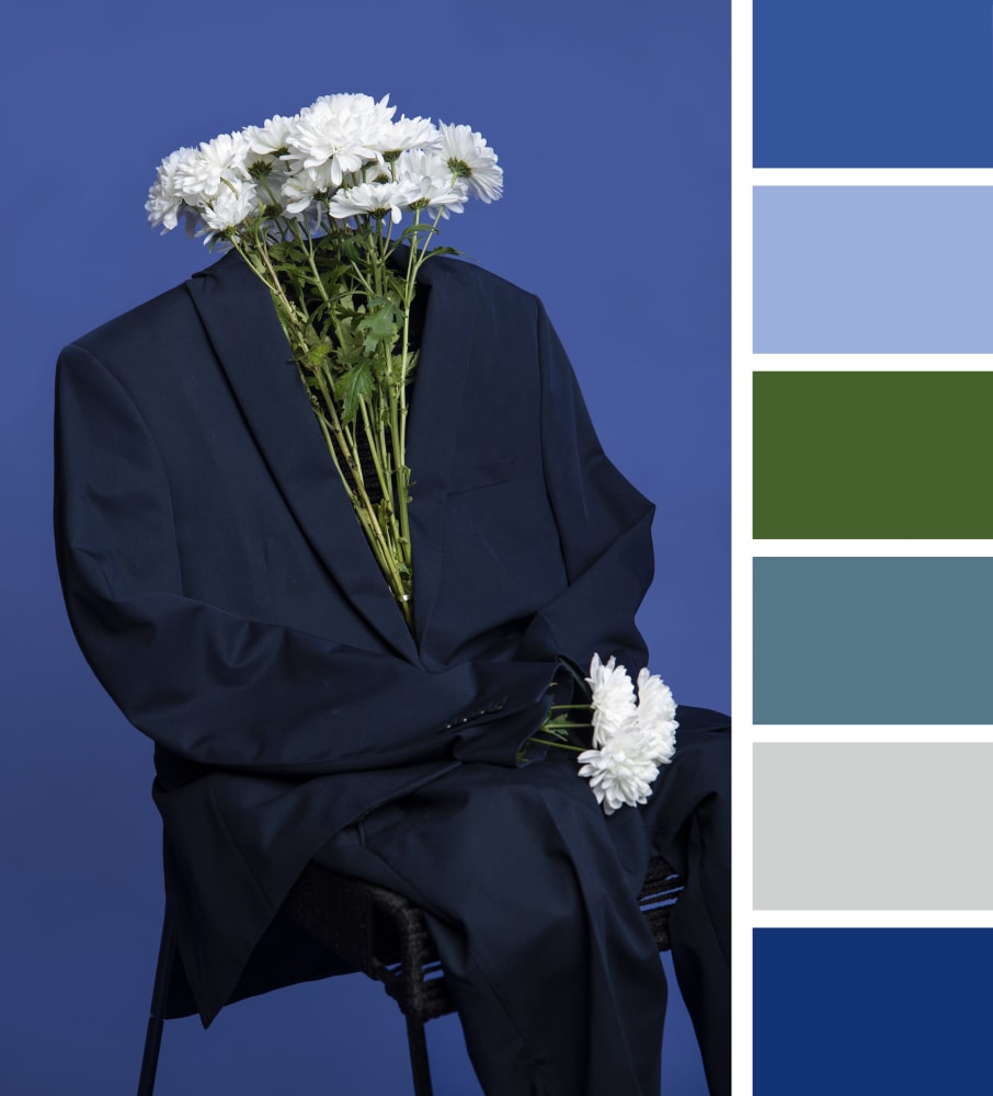
- Midnight Blue, Silver, and Crystal: A modern and very chic option. Midnight blue brings mysterious and elegant depth, complemented by the cold shine of silver and the transparency of crystal. Perfect for evening weddings with a cosmopolitan and glamorous atmosphere.
Boho weddings: warm and vibrant tones
Bohemian weddings celebrate freedom, connection with nature, creativity, and a relaxed but chic spirit. Their colors reflect this energy:
- Burnt Orange, Terracotta, Mustard, and Dried Green: A palette inspired by desert landscapes and artisanal textiles. These warm and slightly dusty tones create a relaxed, artistic, and very welcoming atmosphere. Ideal for outdoor weddings, tipi-style tents, or natural settings with an artistic touch.
- Fuchsia, Turquoise, Purple, and Vibrant Orange: For a boho wedding with a bolder and more exotic twist. This combination of vibrant and cheerful colors evokes traveling culture and the joy of living. Perfect for weddings with ethnic influences, festivals, or celebrations full of energy and color.
Tips for choosing the perfect color palette
Choosing the ideal color palette for your wedding can seem overwhelming, but with some key tips, it will become one of the most fun parts of planning. The key is harmony and that the colors tell your story.
How to combine colors with the venue, season, and style
For your color palette to make sense and be spectacular, it's essential that it's in tune with several key elements of your wedding:
- The Venue: Observe the architecture, materials, and existing colors at the celebration venue. Is it a classic hall with gold moldings? A rustic farmhouse with stone walls? A beach with light sand? Choose colors that complement, rather than compete with, the environment. For example, in a countryside estate, greens, browns, and terracottas will look natural, while in a modern urban hotel, grays, whites, and metallics will fit better.
- The Season: As we saw, the season offers a natural guide. Pastel and fresh tones for spring, vibrant ones for summer, warm and earthy for autumn, and deep and elegant for winter. Aligning with the season will make your wedding feel organic and timeless.
- Your Personal Style (and the wedding's): This is the most important. Do you dream of an intimate and bohemian wedding, a glamorous big party, or a classic and sophisticated event? Your personality and the atmosphere you want to create should be the starting point. If you're discreet, perhaps neutrals attract you. If you're bold, vibrant colors might be your thing. The palette should be a reflection of who you are as a couple.
Online tools for creating color palettes
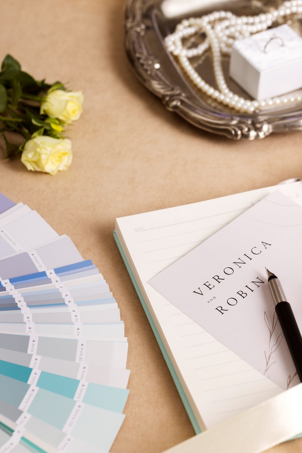
You don't need to be a professional designer to create an incredible color palette! There are many free online tools that can help you get inspired and visualize harmonious combinations:
- Coolors.co: One of the favorites. Generate random palettes with one click, and you can adjust each color, upload a photo to extract colors, or explore palettes created by other users. It's fast and intuitive.
- Adobe Color (color.adobe.com): More advanced but very powerful. Allows you to explore color harmony rules (analogous, monochromatic, complementary, etc.), extract palettes from images, and even see how colors would look for people with color blindness. Ideal if you want to be more precise.
- Canva Color Palette Generator: Simple and effective. Upload an image (perhaps one that inspires you for your wedding) and it will generate a color palette from it. Perfect for translating visual inspiration into concrete colors.
Experiment with these tools, save your favorites, and share them with your partner and vendors to ensure everyone is on the same page.
How to avoid mistakes when choosing your wedding colors
For color choice to be a resounding success and not a headache, keep these practical tips in mind:
- Don't choose too many colors: The ideal is to work with a base of 2 to 4 main colors (1-2 dominant and 1-2 accent). Adding too many can make the decoration look chaotic and without cohesion.
- Consider lighting: Colors look different under natural daylight than under artificial evening lighting. If your wedding is at sunset or at night, make sure the chosen colors still look good with the warm or cold lights of the venue.
- Think about photos: Your color palette will be a fundamental part of your wedding photos. Make sure the chosen tones create a harmonious and timeless background for your memories. Very intense or contrasting colors can divert attention from you.
- Test before deciding: If possible, get samples of the colors in fabrics, stationery, or flowers. Seeing the tones in person and in the context of the venue will give you a better idea of how they'll work together.
- Guest comfort matters: If you suggest or request a dress code, make sure the colors are reasonably accessible and comfortable for your guests to find.
Frequently asked questions about wedding colors
To finish clearing all your doubts, here we answer the most common questions about choosing and using colors in weddings:
What are the best colors to wear to a wedding as a guest?
The safest and most elegant colors for a guest are usually:
- Pastel tones: Dusty pink, sky blue, lavender, mint green, soft coral.
- Blues and greens: Navy blue, royal blue, emerald green, bottle green. They're sophisticated and versatile.
- Jewel tones: If the wedding is formal or evening, an intense purple, burgundy, or dark green can be spectacular.
- Neutral colors with accents: Pearl gray, taupe, or beige combined with vibrant colored accessories.
Always remember to avoid white, and if the wedding is during the day, opt for black with caution or accessories that give it life. The key is discretion and respect for the couple's day.
What colors bring bad luck at a wedding?
Superstitions vary greatly by culture, but in general, it's said that black can attract bad luck if worn by the bride, as it symbolizes mourning. For guests, although in the West it's accepted for evening weddings, in other cultures it might be seen as a bad omen or disrespect.
Green, curiously, has also had connotations of bad luck in some ancient superstitions (especially in theater), but today it's a very popular and positive color for weddings, associated with nature and good fortune.
Ultimately, what brings "bad luck" is more a matter of personal belief than a universal rule.
Is black allowed at weddings?
Yes, black is allowed at weddings, but with nuances and mainly for evening or gala events. For a daytime wedding, black can seem somewhat somber or inappropriate, unless the "dress code" indicates it. If you opt for black at a daytime wedding, combine it with colorful and cheerful accessories to soften it. For evening and formal weddings, an elegant black dress or suit is a sophisticated and totally acceptable option.
What color to wear if I'm a bridesmaid, maid of honor, or witness?
The ideal color for bridesmaids, maids of honor, or witnesses depends greatly on the overall color palette chosen by the couple and their preferences. The most important thing is to consult directly with the couple or the bride.
- Bridesmaids: It's most common for the bride to choose a specific palette for them, which can be a single color in different tones, or several colors that harmonize with each other. They're usually tones that complement the decoration and the bride's bouquet.
- Bridesmaid and Witnesses: Although they're not always assigned a specific color, the bridesmaid and witnesses usually opt for elegant and sophisticated colors that don't compete with the bride, but aren't so eye-catching as to steal the spotlight. Tones like navy blue, emerald green, eggplant purple, silver gray, or even dusty pink or nude, are excellent options. It's always a good idea to ask the couple if they have any preferences or if they want you to follow any color line.
Your Story, Your Colors, Your Invitation!
As you've seen, the color palette is the invisible thread connecting every detail of your wedding, from the flowers to the attire, and of course, to the first impression you make on your guests: the invitation.
At Specially Love, we understand that every couple is unique and that your colors reflect your love and style. That's why our digital wedding invitations are designed to be completely customizable, allowing you to perfectly integrate the color palette you've chosen. Whether it's a vibrant terracotta for a boho wedding, a soft dusty blue for an ethereal romance, or classic black, white, and gold for timeless elegance, we can adapt your invitation to be the perfect preview of your big day's atmosphere.
An invitation that not only informs, but also excites and immerses your guests in your wedding experience from the very first click. Let your color palette come alive in an invitation that will be as unique as you are!
Ready to design the invitation that has it all, with the colors of your dreams? Explore our templates and start creating your perfect digital invitation at Specially Love!