
Customize colors on your digital wedding invitation
- #digital invitations
- #wedding trends
- #wedding planning
The invitation is one of the first things your wedding guests will see, so we want it to match your style. Our designs start from predefined color palettes, built around some of the most common wedding tones, but you can customize them to match whatever color you want.
Make the invitation feel like your wedding
When the colors of your invitation match the bouquet, décor or stationery, everything feels more considered. You do not need to repeat it all: if one or two tones are recognizable, it already works. If you want to know what each color means or which ones guests should avoid, we cover it in our article on the wedding color palette.
Choose the colors on your digital invitation
All our designs include predefined color palettes based on the most used wedding color combinations (according to our data).
On top of that, all of them can be fully customized so you can fine-tune them for your wedding. While you can choose colors directly in our online editor, you can also request them on demand.
| Design | Available colors | Customizable palette? |
|---|---|---|
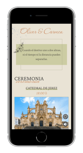
| Classic | Olive, beige, mint and blue | Yes |
| Watercolor | Pink, emerald, blue and beige | Yes |
| Coquette | Red, olive, beige and navy blue | Yes |
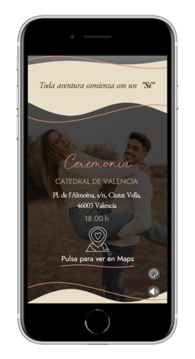
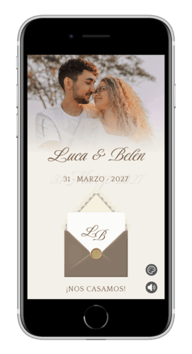
| Elegant | White, beige and terracotta | Yes |
| Minimalist | White, black, gold and green | Yes |
| Beach | Beige, blue, terracotta and brown | Yes |
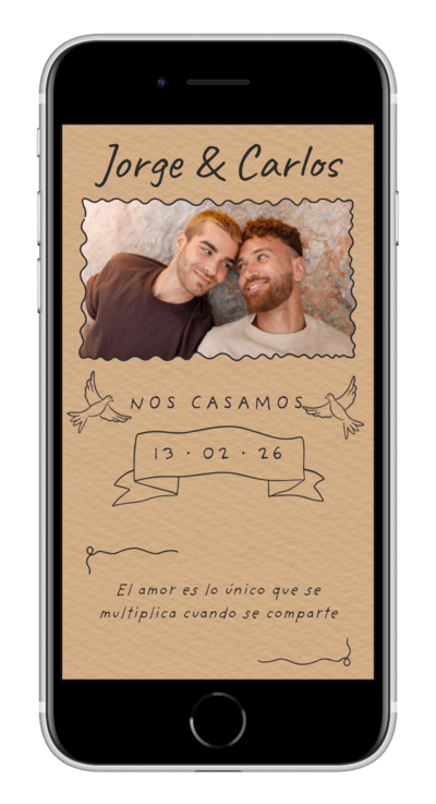
| Kraft | Terracotta, brown, yellow, navy blue, green and burgundy | Yes |
| Passport | Brown, green and blue | On demand |
| Film | Black and beige | On demand |
| Vintage | Brown, beige, blue and mint | On demand |
| Simple | Green, garnet and black | On demand |
This way you can keep the design you love and choose the combination that best suits your wedding. If you are having a sage-toned bouquet, for example, you can look for a palette that follows the same direction.
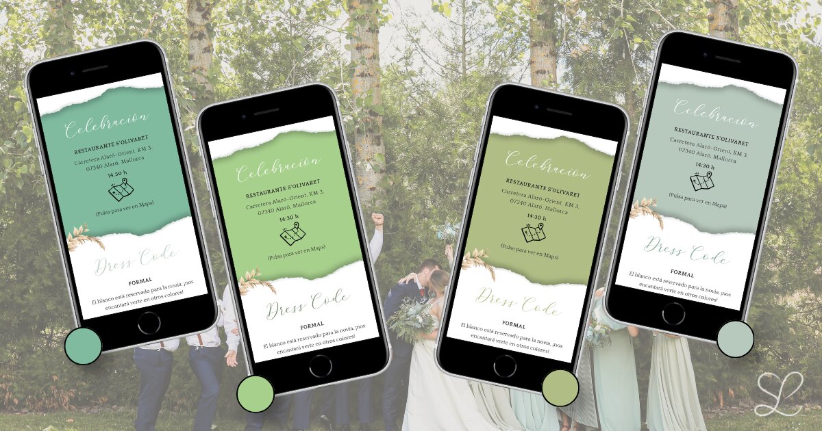
Want to try color customization? Open the editor to create your free wedding invitation and try the different color palettes.
Wedding invitation ideas by color
There is no single perfect palette for a wedding. You can start from the venue, the season, the flowers or simply the colors you identify with most. Some designs let you adapt the palette, while others include ready-made combinations so you can find an option that fits you.
Wedding invitations in shades of blue
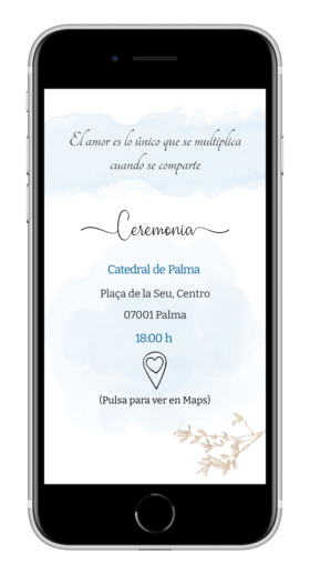
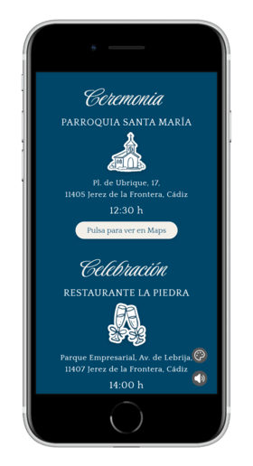
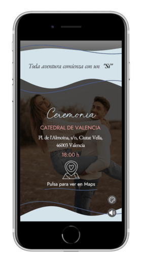
Blues feel calm and fresh. Light and watercolor tones work especially well for seaside or daytime weddings, while navy blue adds a more formal note. You can find them on the Watercolor, Classic, Vintage, Passport, Coquette, Beach or Kraft designs, which now also includes a navy blue palette.
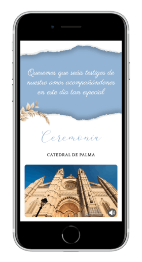
Wedding invitations in green and natural tones
Olive green, sage, mint, pistachio and other soft greens work especially well for estates, gardens and daytime weddings. They are also a good way to bring botanical inspiration into the invitation without overloading it. This color usually pairs well with beige or light brown tones, combinations you will find in our Minimalist, Classic, Vintage, Kraft, Passport, Elegant, Coquette and Simple designs.
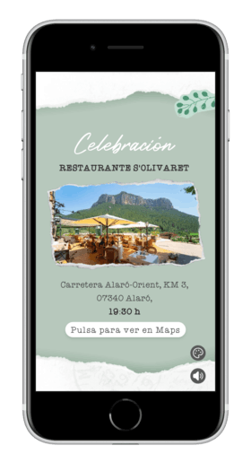
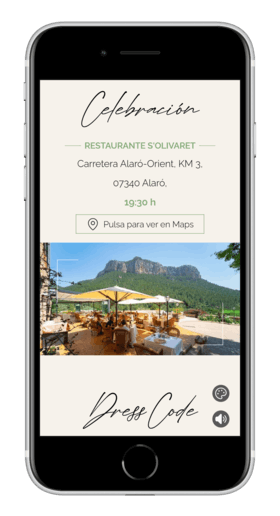
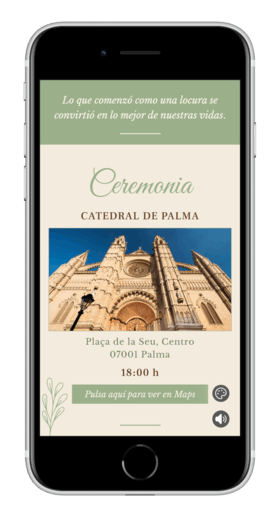
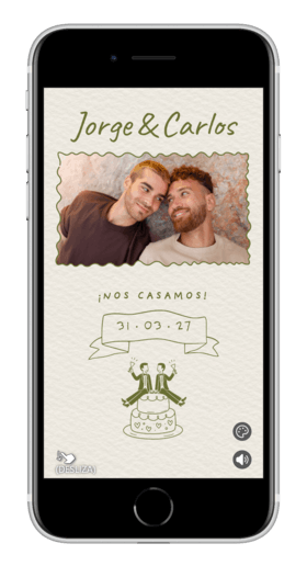
Wedding invitations in white and neutral tones
White, beige, black and gold are easy to combine and let photographs and wording take center stage. They are a safe choice for minimalist weddings, elegant celebrations or couples who prefer a clean look. Elegant, Minimalist, Film and Classic are good places to start.
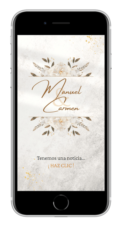
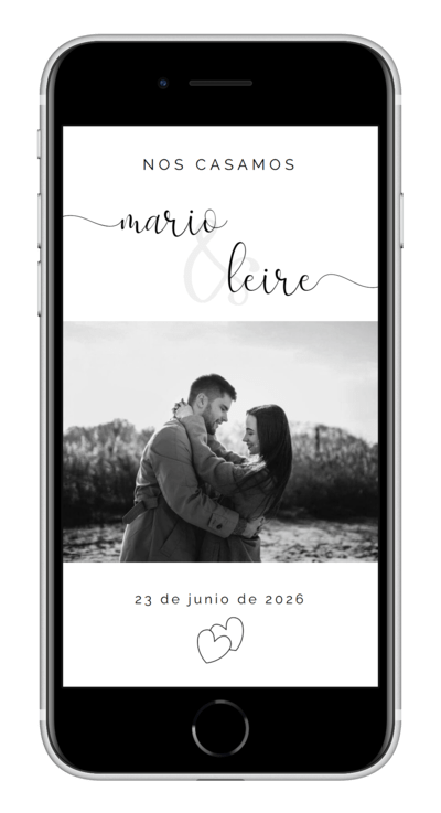

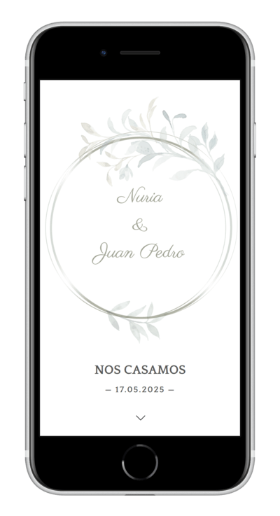
Wedding invitations in warm and earthy tones
Beige, terracotta, brown, yellow and burgundy create a welcoming feel and work especially well with autumn weddings, countryside celebrations and rustic décor. Kraft now includes a new burgundy option, as well as green and navy blue; Beach, Vintage and Elegant also offer warm combinations.
Wedding invitations with flowers
Floral motifs are ideal if you want a romantic, natural invitation. On the Classic invitation you can currently choose from five options.
Olive leaves
For Mediterranean weddings, country estates or venues with plenty of natural light. They pair beautifully with soft greens and earthy tones.
Daisies
Fresh and simple. A great match for daytime, outdoor weddings with a relaxed feel.
Lavender
Soft and calm, with a French countryside feel. A good choice if your wedding includes lilacs, violets or light greys.
Pampas
The most contemporary option, and especially suited to beige, sand and dried-flower décor.
Lemon tree
Cheerful and summery. Perfect if you are getting married near the sea or want a bright citrus touch.
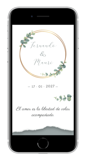
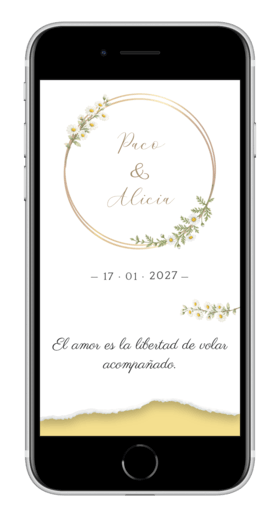
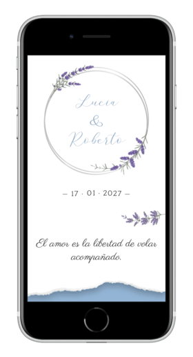
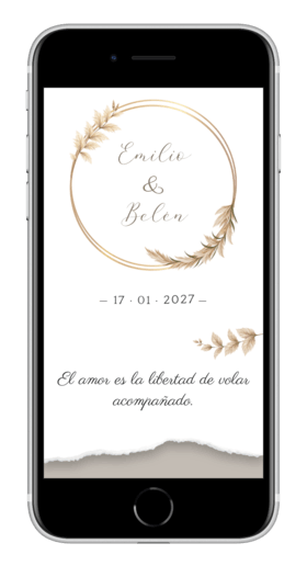
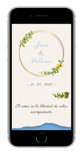
For now, choosing flowers is only available on Classic. Coming soon, we want to explore bringing this option to other designs such as Vintage, Elegant or Watercolor.
How to match your invitation colors to your wedding style
Before choosing a palette, think about the overall atmosphere you want to create. You do not need to copy every detail of the décor: repeating one or two tones is enough for the invitation and the wedding to feel connected.
- Choose one main color, one supporting color and a neutral tone.
- You can repeat a color from the bouquet or décor without needing it to be identical.
- Look for contrast between the background and the text so all the information is easy to read.
- Always check the result on a phone, where most of your guests will see it.
Frequently asked questions
Which colors are most used at weddings?
Green, white, blue, beige and terracotta tones are among the most used. Green brings a natural feel; white, light; blue, calm; beige, warmth without overload; and terracotta, a welcoming touch. There is no mandatory color: what matters is that it fits the venue, the time of year and your style.
How do you choose colors for a wedding?
Start with the venue and the season you are getting married in: a spring estate calls for something different from an autumn evening celebration. Then choose one main color, one that supports it and a neutral tone. Before deciding, try them together in flowers, fabrics and on screen to make sure they work across every wedding element.
Which colors work well together for a wedding?
Some combinations that usually work very well are green, beige and white; navy blue, white and gold; terracotta, beige and olive; or light blue, white and sand. The result feels more balanced when one color is the focus and the others support it.
How do you match wedding colors with the flowers?
The flowers do not need to match the whole palette exactly. Pick one tone from the bouquet as a connecting thread and complete it with greens, white flowers or soft shades. That same color can appear subtly on the invitation to tie everything together.
How do you choose wedding colors based on the décor?
Look first at what the space already brings: stone, wood, greenery, sea or a darker reception room. It is easier to work with those colors than to try to cover them up. If the venue already has a strong personality, save the more intense tones for small details.
How do you choose the color of wedding invitations?
The invitation should give a first hint of the celebration’s style. You can take one or two tones from the flowers or décor without copying the whole palette. It also helps to prioritize contrast and readability on mobile; depending on the design, you will be able to customize the colors or choose from several available combinations.
Find your wedding invitation and customize it your way
You can start in the editor, browse every design in the catalog, or read the complete customization guide. And if you would rather we take care of it, write to us.